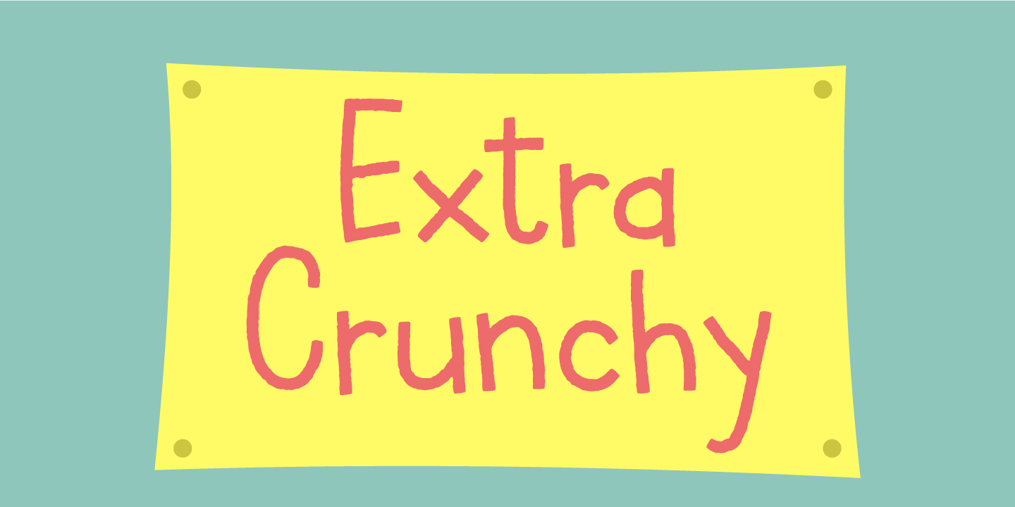



Extra Crunchy
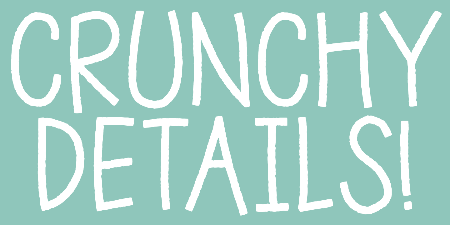
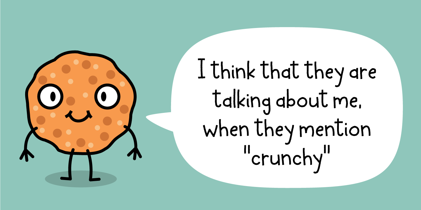
You may wonder why this font is called Extra Crunchy…and to tell the truth, I ate a whole box of crunchy cookies while drawing the letters! The letters are a bit jumpy, and have no steady x-height, however, your text may look a bit off, but it is clear and legible. Fits perfect for a children's book, a postcard/poster design or something else that needs that extra crunch :)